How to Successfully Submit Art Files

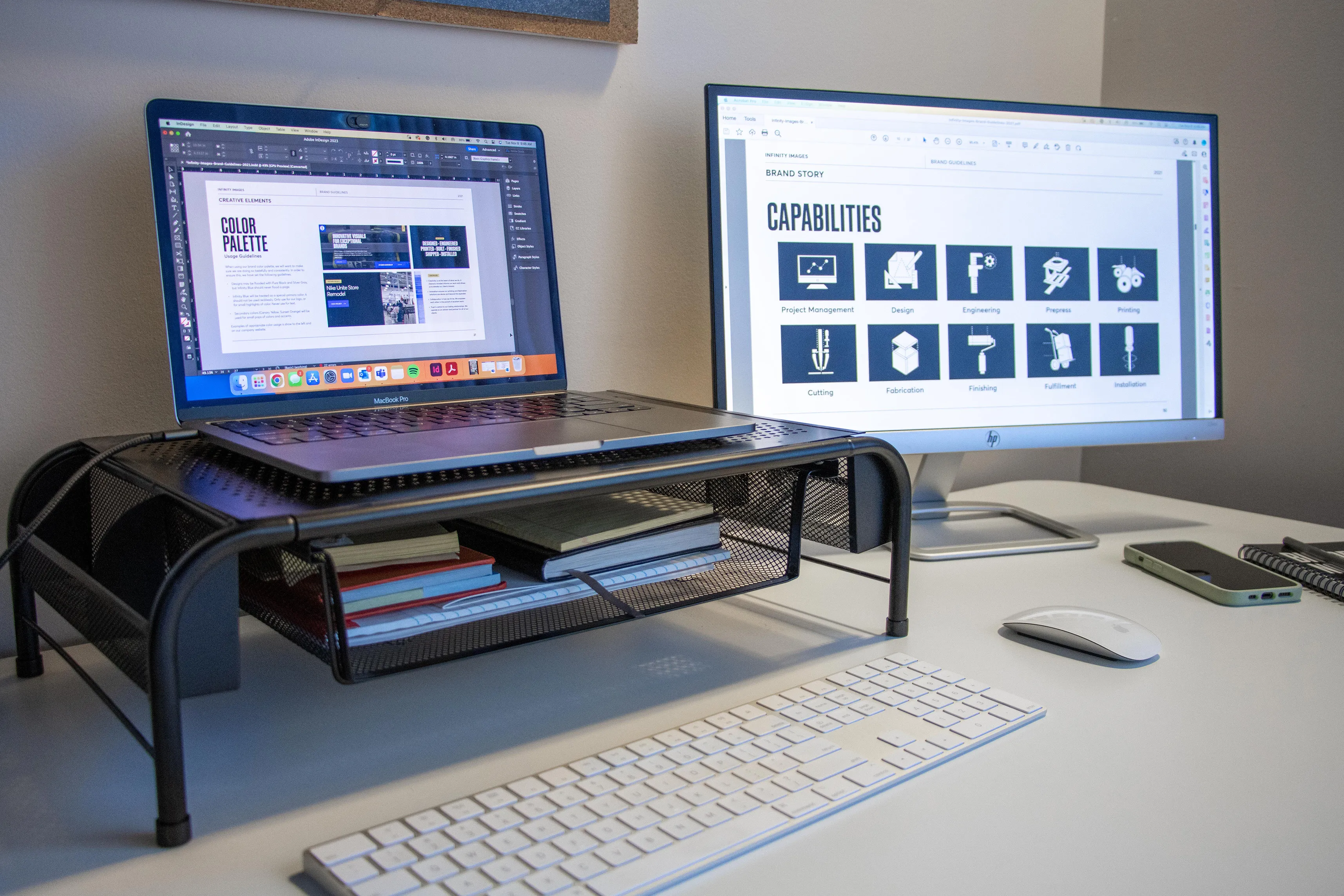
Bringing your brand to life all starts with creating a comprehensive print-ready art file. Please use the file submission guidelines outlined below to prepare your artwork so that it flies through our prepress department into production.
FILE FORMATS
For most graphics, high-resolution, print-ready PDF is the best format to use when sending art to us. We have created a PDF Preset for use InDesign software to make it easy to export PDFs with appropriate settings for output. You may download the preset file HERE.
If you would like us to make design or major layout changes, please supply native and layered Adobe InDesign or Illustrator files when sending artwork so we have maximum flexibility in making the changes you request. Any additional elements like fonts, images, and graphic files should also be supplied along with the layout files. We support the latest versions of applications in the Adobe Creative Cloud suite.
LAYOUT SETTINGS
Size
Set files up at 100% of final size whenever possible. Larger files can be built at 1/2, 1/4, or 1/10 scale if needed. Make sure to note any layouts that are not built at final size. Note that some graphics, like large murals or window graphics, may need an additional 1”–2” trim allowance on each edge for proper installation.
Bleed
To avoid problems with trimming your graphics, make sure to add the appropriate amount of bleed to the outside edges of all artwork. Single-sided art requires 1/8” bleed, double-sided art requires 1/4” bleed and art for all fabric graphics requires 1/2” bleed.
Safety Area
Make sure to keep critical layout elements like logos, text, or important image components out of areas that will get special finishing. These areas include hems, pole pockets, grommets, and panel seams.
IMAGE RESOLUTION
Keep the intended viewing distance of the final graphics in mind when calculating the image resolution needed for printing. Large graphics that will be viewed from a distance can be built with images that are much lower resolution than smaller, close-up graphics and still look great in the final installation.
Intended Viewing Distance Recommendations:
- Small Graphics (36” H x 48” W or smaller): 150-300ppi at final size
- Medium Graphics (36” H x 48” W to 60” H x 120” W): 120-200ppi at final size
- Large Graphics (murals or large banners above 60” H x 120” W): 75-120ppi at final size
TRANSPARENCY EFFECTS
Although transparency effects can add impact to a design, they often cause problems during output. For best results, follow the guidelines below.
Do Not Mix Color Spaces
CMYK graphics interacting with RGB images (or vice versa) can cause color shifts when output. Make sure to build all page elements that interact via transparency in a single-color space.
Spot Colors
Transparency that interacts with spot colors (like Pantones) can often cause errors when processing for print. Converting all spot colors to process colors (CMYK or RGB) can help prevent problems.
Leave Transparency Intact
Don’t flatten transparency effects in images or layouts before submitting art. Leaving transparency effects “live” will allow us maximum flexibility in preparing your files for output.
COLOR SETTINGS
Embed All ICC Profiles
Embedding color profiles into your image and layout files gives us a starting point for accurate color transformations when printing your files.
Working Spaces
We’ve found that the best profiles are AdobeRGB1998.icc for RGB and GRACoL2006_Coated1v2.iccfor CMYK. We can also work with other color spaces you have defined if you have other preferences. The most important thing to remember is to tag your files with source profiles so we have a reference point for color transformations.
Output Profiles
Do not convert images or layouts to an output profile (specific printer + media combo). Doing so targets the color of the file for that specific output device and can cause issues when repurposing files for output on a different printer.
COLOR MATCHING
If you have specific color matching requirements, please supply a color match proof or color swatches for reference when submitting your art files. Please note that custom color correction may be an additional charge. Consult with your Infinity Images project manager for details.
In the absence of specific color matching instructions, we will use our calibrated software and hardware systems to provide prints that match as closely as possible to industry standards. Please note that some colors may not be achievable on all output devices.
REFERENCE
PDF Hardcopies
For complex graphics or design projects, providing a PDF or color hardcopy for layout reference helps us meet your expectations when outputting your files.
Proofs
Electronic proofs will be provided for all files in order to ensure layouts are correct. For guidance on how to review and approve art proofs, please see our blog post Your Guide to Reviewing Art Proofs.
Please note that electronic proofs are not color accurate and should not be used for approving color. If requested, we can provide press proofs for color approval. Please consult with your Infinity Images project manager for availability and pricing.
Let's Get Started
Neon printing is more than just a visual effect — it's a strategic choice for brands looking to deliver memorable, high-impact experiences. If you'd like to enter the world of neon printing, send us a message! We'd love to help you bring your fluorescent big idea to life.


